Time data is everywhere: in every internet activity, every communication, every geopolitical event.
In this webinar, data visualization expert Corey Lanum shares some best practices for visualizing time-based data using KeyLines and ReGraph, our graph visualization tools, with KronoGraph, an innovative way to build scalable timeline visualizations.
He shows you how to:
- neatly filter and summarize complex time-based connected data
- reveal insights that bring out the story behind your connected data
- pick the right time-based data visualization techniques for your project
FREE: Start your trial today
Visualize your data! Request full access to our SDKs, demos and live-coding playgrounds.
Prefer a written version? Here’s an illustrated write-up.
In this webinar we’ll take the concepts of graph visualization and apply them to data that has a date-time component, so we can visualize how our graphs change over time, or find patterns in our data.
Why add a date-time component to your visualization?
The traditional way to visualize graph data is with a node-link visualization.
The event visualization on the left shows a sequence of money transfers between accounts. It’s easy to assume that each transfer happened in quick succession, but there’s no date-time component to back this up. The transactions could be years apart, and unrelated. To get the full story, we need a new way of looking at our data.
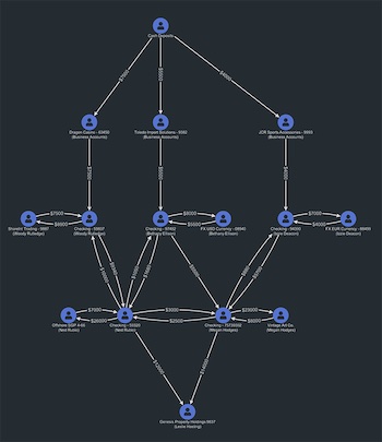
Here’s another node-link visualization, that shows an insurance fraud case:
This chart focuses on connections, rather than the sequence of events. Nodes represent cars, individuals, claims and so on. We’re interested in the person at the center of the chart. They were involved in several accidents, and went to the same mechanic for the same type of repair. This could be suspicious if the accidents happened within months – less so if they happened over the course of ten years. That’s the difference a date-time component can make to your graph.
What do we need from a time visualization?
We’ve seen how important it is to know when events happened. We can also use time data to show:- The range of time in which nodes were active
- The duration of events
- Spikes in activity
- Sequence of events
- Simultaneous events
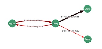
Adding date-time labels to links is one way to show the timing or duration of events:
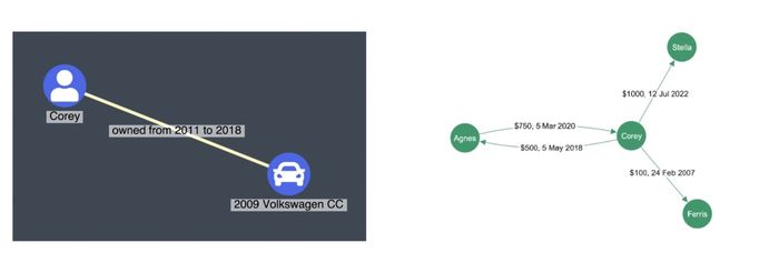
The labels on the money transfer chart above show that some transactions happened within the same year, while others were decades apart. This added info makes a big difference to the meaning of the chart, but there are more intuitive ways to visualize our time data.
Color-coding is another option. In this example, redder links show older transactions, and darker links show more recent ones. This technique can help you quickly identify the outliers:
A series of snapshots across time shows how the structure of your data is changing, when you don’t need to see the finer detail. This example from the P.L.O.S. journal shows the evolution of the United States Congress over several decades, visualizing the cross-authorship of various bills and their public sponsors:
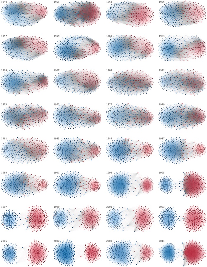
Each Congress is represented by a different chart, with red Republican nodes and blue Democrats. The visualization shows us when each party made significant gains. For example, in 1995 and 2011 a lot more Republicans were elected, so we see the red area grow. In 1989 and 1991 we see many more blue Democrats in Congress. But we also see a decrease in bipartisanship over time. In the 40s and 50s, the grey links between red and blue nodes show that bills were being co-authored by multiple parties – but those connections have almost disappeared by 2003.
Showing graph data over a timeline
For centuries, we’ve used timelines to visualize data that changes over time. As far back as the 11th century, the Bayeux Tapestry charted a sequence of events, flowing from left to right. You can see some more modern examples below:
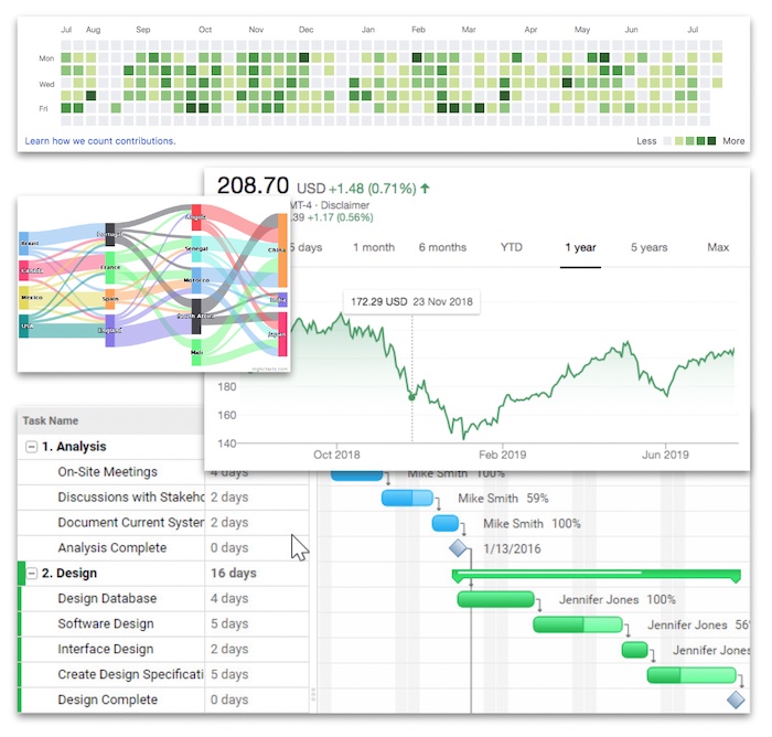
A heat map shows times that were more active than others; the Sankey diagram is a process flow. The Gantt chart is often used as a project planner, and a stock price ticker shows fluctuations of a single entity over a period of time. What all of these charts are missing, though, is a way to show connections, and how patterns in those connections change over time.
KeyLines and ReGraph, our graph visualization products, have a time bar component that allows you to view connected data alongside a histogram, helping you identify and understand spikes in activity:
The colored selection lines across the histogram show patterns associated with the node of the same color. We can use the time bar to drill down to specific segments of time, and the chart will automatically adapt to visualize data from that period.
Working with large data sets
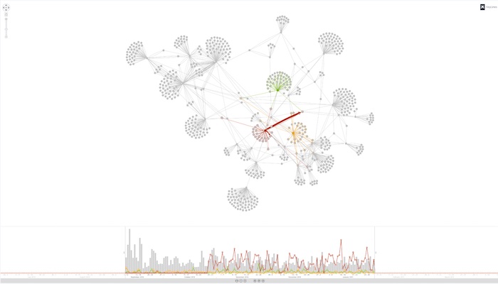
When you’re working with billions of nodes and links, and you want to see them all in a single visualization, KronoGraph has the solution.
The heat map view groups both events and entities, giving us a broad overview in a single visualization that helps us decide where to start our investigation. By zooming in, we transition from the heatmap to the timeline view that shows individual events, the connections between those events, and the nodes that caused them.
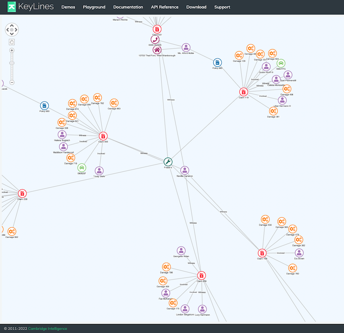
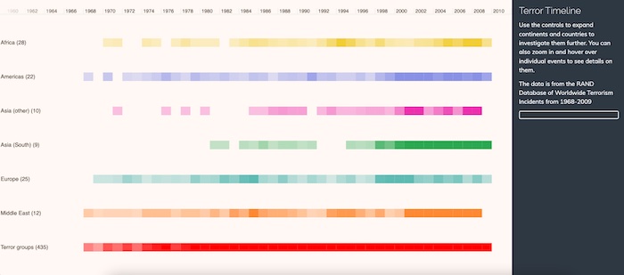
In this example, we’re looking at a timeline of terrorist activity around the world over several decades. We’ll drill down from 40 years to a single event. The heatmap view shows a distinct spike in activity in Africa in 1994, where the shade of yellow is denser:
Zooming in to that window of time takes us to the timeline view:
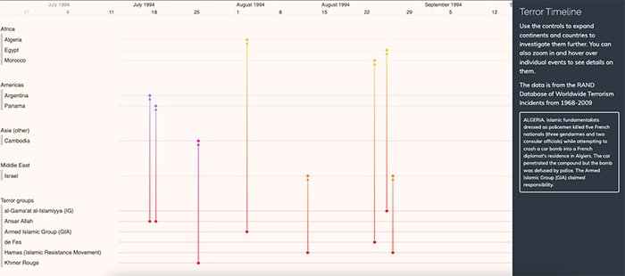
The timeline view groups entities together as horizontal lines, and events as vertical connections between them, along a timeline. In this example we can see the Armed Islamic Group connected to a terror attack in Algeria in August, and information in the panel on the right explains the details of the event.
Here’s another example of a heat map view, where we’re looking at windows of time not as absolute units, but as cycles or patterns of life. The data relates to internal emails within an organization over the course of 10 months:
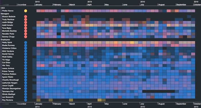
We can see who is active, and when – and we can drill down as we did before, to an individual day:
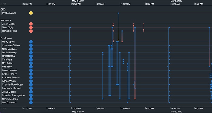
I’ve chosen to focus on May 4th, 2010, and find out which of my employees were exchanging emails on that day. I can also use this view to look at the time of day that sees most activity, no matter what the day. We call that either “pattern of life visualization” or “scale wrapping”:
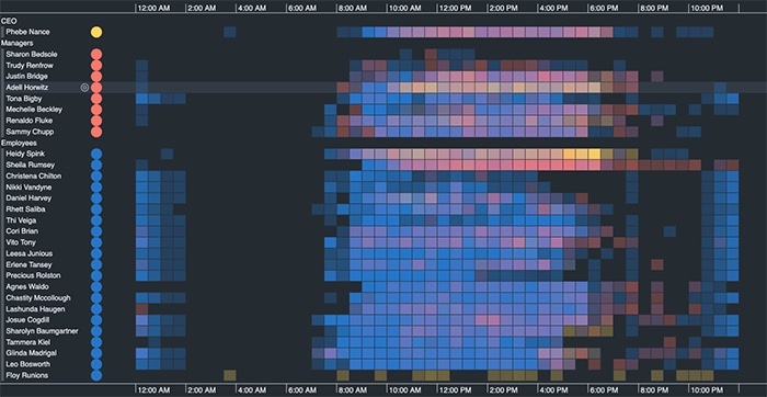
We’ve condensed all of those days across 10 months into a single view of a 24-hour period. We can see that employees typically start their work day somewhere between 7am and 9am, and they’ll taper off from around 6pm – but some night owls are active up until about 9pm. We can see a lot of activity at midnight, which is unusual – but if we zoom in, we might see that they’re automated mailouts.
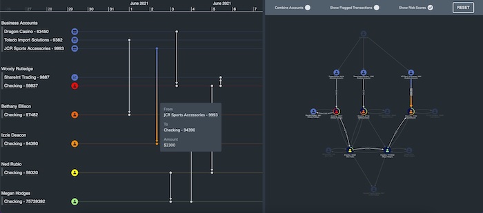
And finally, let’s combine a traditional node-link visualization with the timeline view:
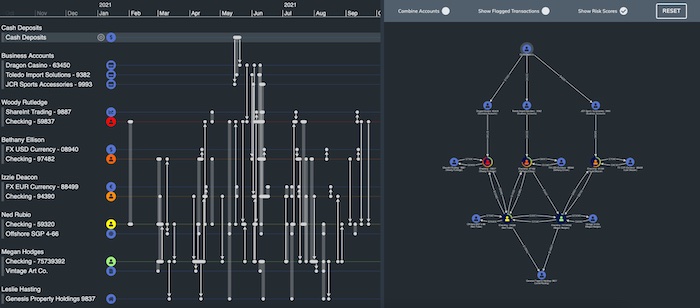
There’s a lot to be learned from both looking at the “when” and the “who”, by viewing time data and connections at the same time. Here we’re returning to the money flow example. I have the same data in a timeline view and a node-link visualization. By showing both at the same time, this interactive timeline tool gives a very good picture of what’s going on.
Earlier on, we couldn’t see the sequence of activities. But now, when I hover over a link in the timeline, I can see that one of the $10K transfers actually comprises three separate transactions over three months in 2021. I could also zoom into the first week of June on the timeline, and see on the graph representation which nodes were active during that time frame:
Test out our data visualization toolkits on your time-based data
Each one of the techniques I’ve shown you has benefits and drawbacks. Which one you select depends a lot on the use case, and what you’re trying to show your end users. The time bar piece is built into our graph visualization toolkits, KeyLines (for JavaScript developers) and ReGraph (for React developers).
KronoGraph, our timeline SDK, is a separate product that works alongside them.
FREE: Start your trial today
Visualize your data! Request full access to our SDKs, demos and live-coding playgrounds.