KeyLines features
Powerful graph visualization and analysis functionality
Want to know more? Download the white paper
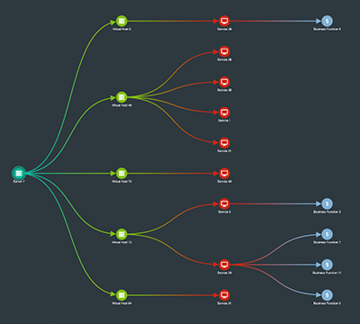
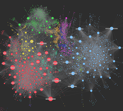
Automatic layouts
See connections clearly with powerful graph layout algorithms.
A good layout will detangle links to reveal patterns and anomalies. KeyLines offers 8 automatic layouts to suit any kind of network.
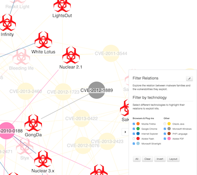
Network filtering
Focus on the nodes that help you tell the story with powerful and flexible filtering.
Define your own filter logic to suit your complex data and make sense of huge networks.
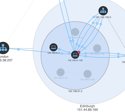
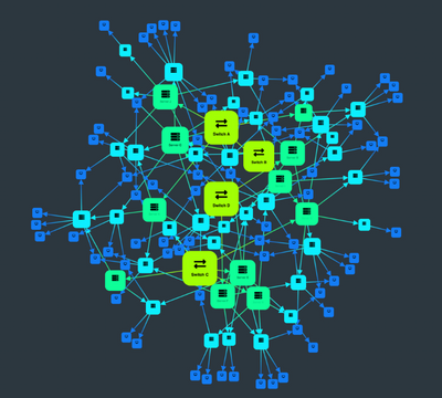
Node combining
Combos are an intuitive way to group nodes and hide clutter, revealing insight in the biggest and most complex graph datasets.
See how they make it easy to explore your data in a manageable and meaningful way.
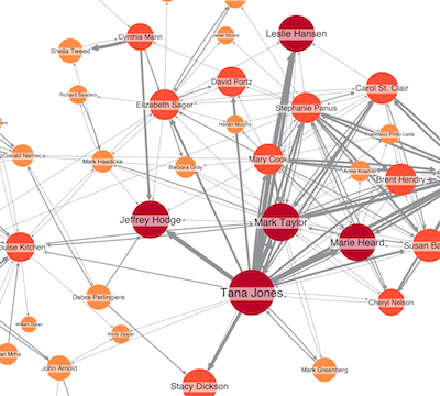
Social network analysis
Uncover key players with the most power and influence in your network.
KeyLines offers powerful graph algorithms to help your users understand network behavior, structure and interactions.
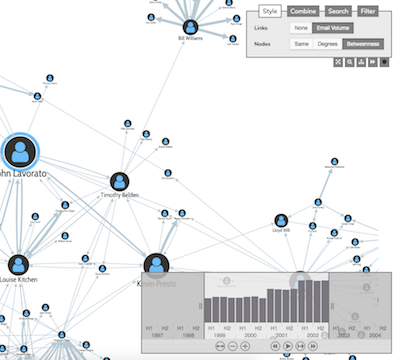
Time-based analysis
Graph data is rarely static. Our tools for time-based graph analysis make it easy to see how connections evolve over time.
Use them to focus on specific time periods, compare activity, or spot trends and outliers.
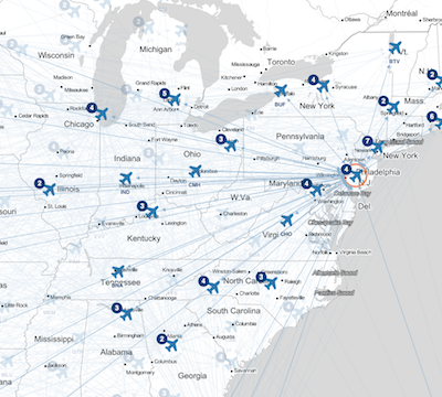
Map mode
Use KeyLines’ map mode to switch seamlessly from network to geographic view.
It’s easy to integrate with third party map tiles and plugins, letting you show your data on the maps your users need to see.
Custom styling
KeyLines allows you to customize every element of your app to suit your data and the questions your users need to answer.
Find out how you can build 100% customized applications.
High performance
With KeyLines, there’s no trade off between speed and quality. Our carefully optimized code and powerful WebGL graphic rendering means you can visualize large and complex datasets quickly and easily across all modern browsers.

Expert support
We’ve been helping teams build market-leading graph visualization applications since 2011.
Our team of experts is by your side every step of the way, giving support and advice from first login to product launch and beyond.


