Over the past three years, we’ve been approached by hundreds of organizations from around the world for help understanding their data.
They come to us because network visualization is an effective way to get insight from large and complex datasets. Like any powerful tool or technique, however, graph visualization must be used carefully to avoid producing a window into your data that is useless, or even worse, misleading.
Here’s our list of the top 5 network visualization mistakes.
1. Cramming too much data on a chart
This is a common error of novice visualizers – the theory is that if a little data produces a few insights, then a lot of data will produce lots of insights.
This is rarely true.
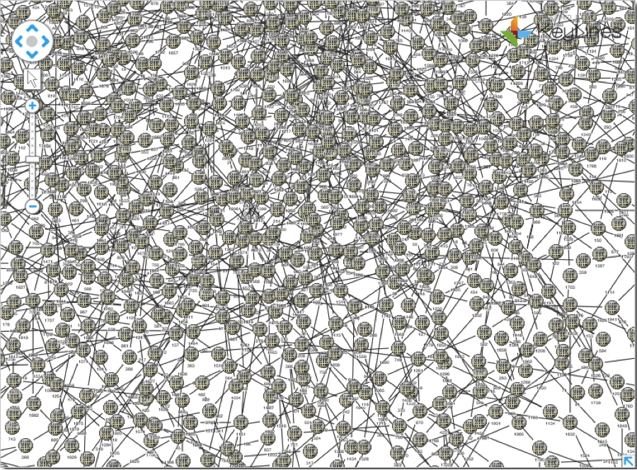
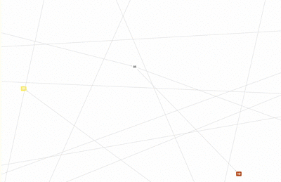
Especially with tightly connected data sets, where many nodes are connected to many other nodes, increasing the number of nodes on the chart will exponentially increase the number of links to be drawn. Eventually, you end up with so much clutter that no automatic layout can help you.
We present ‘the hairball’:
Using filters, combinations, and expand capabilities, you can present a manageable volume of data to the end users, and allow them to determine which subsets are of interest to them.
2. Using counter-intuitive design
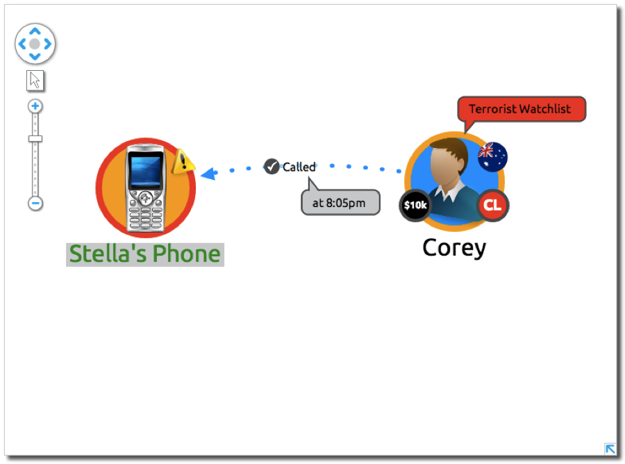
Our visualization products allow you to map many styling features to any property of the nodes and edges in your data, i.e. you can say you want all nodes of type ‘X’ to be green, or for the width of a link to represent relationship strength.
It’s a powerful feature that can help create a lot of insight – if used correctly.
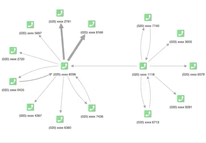
If the designer decides to use link width to represent something else – perhaps to indicate the time the people met – the end user would have no idea what to deduce.
If time-of-day were an important property of the relationship to display, a much better visual indicator to use would be glyphs on the links – say a green dot for business-hours communications, a yellow dot for nighttime communications, and a red dot for weekends and holidays.
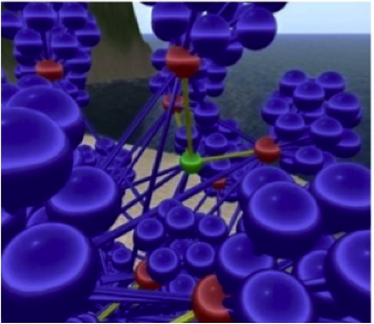
3. Three dimensional visualizations
We get asked about 3D visualizations a lot. Usually after a short discussion, customers come to their senses and realize 3D is not going to help their project.
Here are our top 5 reasons to steer clear of 3D:
- Your monitor is (almost always) 2D
- Most machines have no easy way to navigate in 3D
- Thanks to perspective, node and link sizing becomes a lot less valuable in 3D
- Nodes and links can hide behind other nodes and links
- It rarely looks good.
Perhaps if data analysts take to Oculus Rift-style headsets, we’ll change our mind. But for now, 3D isn’t a great option.
4. Too many variables
There are dozens of node and link visual properties you can control through our APIs – and any one of them can be linked to a property of the underlying data.
Avoid the temptation to use them all at once.
A much more helpful visualization would allow the user to switch between views that emphasized the relevant parameters so that the user could view them independently.
5. Over-animating
Animation adds a lot of value to visualizations, but it is certainly possible to go overboard.
Our design principle is that animations should represent transitions from one state of the chart to another, and that items on the chart should not move around unless the user requests it.
So, for example, you should animate whenever a new layout is requested. You should not animate every time a user drags a node to a new chart location.
Having nodes bounce around each time the user wants to move a single element is just disorienting. Plus, manually moving items around on a chart is often the final step to creating a final product that can be saved, shared, and printed using export capabilities – the key is to make it quick and easy.
And may feel seasick.
Want to design your own visualization?
If you want to put our advice into practice, go ahead and request a free evaluation.


