
If you work with software, it’s almost certain Stack Overflow has rescued you at some point in your career.
The sprawling Q&A site has about 3 million registered users and 7 million questions. If you find yourself stuck with a programming problem, you’ll probably find the answer on Stack Overflow.
We thought it would be fun to take a closer look at Stack Overflow’s data, so we built a visualization application in KeyLines, incorporating the Time Bar and the new ‘Time Bar Merge function’, which enables the user to call additional data from the database and merge it into their existing chart, simply by adjusting their time bar sliders.
This post explains what we did, and how you can try it for yourself.
Note: To access the KeyLines SDK, you will need to request a login.
Getting started
Access the Stack Exchange API
Earlier this year Stack Exchange updated their API to version 2.2. You can make up to 300 calls a day from your IP without registering, but if you prefer, you can register for an API key . This will extend your request limit to 10,000.
We recommend taking some time to read through the top-level documentation, to get a feeling for how the API works.
Download KeyLines
Next, take some time to familiarize yourself with the KeyLines SDK documentation and then head over to the Downloads page and npm install the KeyLines package.
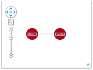
You can run a quick ‘Hello World’ test using the following code snippet. The ‘Getting Started’ page in the SDK has more detail:
<!DOCTYPE html>
<html>
  <head>
    <!-- libraries we want to use, e.g. jQuery -->
    <script src="jquery.js" type="text/javascript"></script>
  </head>
  <body>

  <!-- This is the HTML element that will be used to render the KeyLines component -->

  <div id=”chartID” style=”width: 400px; height: 300px;” ></div>

  <!-- This is the actual code to load KeyLines in the page -->

  <script type='module'>
  import KeyLines from './node_modules/keylines/esm/index.js';
  // This will store a reference to our KeyLines chart object
      var myChartItems = [];  // This array will store our node and link definitions

      // wait until the fonts are loaded to start
      $(window).load(function () {

        // Set the path for the assets
        KeyLines.setCanvasPaths(‘assets/’);

        //load the component: specify the id and callback
        KeyLines.createChart('chartID', chartReady);
      });

      function chartReady (err, chart) {
        // Store a reference to the KeyLines chart object
        myChart = chart;

        // Use our helper functions to add the node and link definitions
        addNode('id1', 'Hello','#B9121B');
        addNode('id2', 'World','#B9121B');
        addLink('id1', 'id2', '', '#4C1B1B', false);

        // Load the chart with the newly defined nodes and links
        myChart.load({
          type: 'LinkChart',
          items: myChartItems
        });
      }

      // Helper function to add a new node definition to our chart items array
      function addNode(nodeId, nodeTitle, colour){
        myChartItems.push({c: colour, id: nodeId, t: nodeTitle, type: 'node',x: 100, y: 100
            });
      }

      // Helper function to add a new link definition to our chart items array
      function addLink(nodeId1, nodeId2, linkTitle, colour, directional){
        myChartItems.push({a2: directional, c: colour, id: nodeId1 + '-' + nodeId2,
              id1: nodeId1, id2: nodeId2, t: linkTitle, type: 'link'
            });
      }
// ]]>
</script>
Link KeyLines to Stack Overflow
The next step is to get data out of the Stack Exchange API and into the KeyLines chart:
Call the Stack Exchange API
When the user interacts with the data – by expanding a node or dragging the time bar, for example – KeyLines raises an event, triggering a URI request to be sent to the Stack Exchange API. The API contains some handy interfaces to help us understand and construct the URIs we need. For example, to search for questions with ‘Neo4j’ in the title in September 2014:
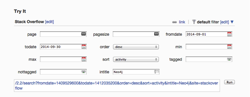
The following code snippet explains how to send an AJAX request for data to Stack Exchange. We can call the API with different parameters for ‘query’, for example, to send search queries or to make requests for answers to particular questions:
// helper method to send JSONP responses to stackexchange API
var makeReq = function (query, from, to) {
  // http://api.stackexchange.com/docs/throttle
  // stackoverflow takes weird dates (divide normal date by 1000)
  var dates = 'fromdate=' + parseInt(from / 1000, 10) + '&todate=' + parseInt(to / 1000, 10);
  requestsInProgress++;
  setFormEnabled(false);
  // Save a ref for the request, later will use it to fetch and merge the data all together
  var promise = $.getJSON('http://api.stackexchange.com/2.2/' + query + dates + '&site=stackoverflow&callback=?')
  // on Error
  .fail(reportError)
  // on Success
  .done(updateRequestsRemaining)
  // things to do on every request
  .always(function () {
    requestsInProgress--;
  });
  return promise;
};
Get a response
KeyLines requires the data to be loaded as a JSON object. The Stack Overflow API removes the need for too much data processing by returning responses in JSONP format, like this:
{
      "tags": [
        "neo4j",
        "cypher"
      ],
      "owner": {
        "reputation": 55,
        "user_id": 2796181,
        "user_type": "registered",
        "accept_rate": 10,
        "profile_image": "https://www.gravatar.com/avatar/13838b5fd7185171816d3785d2671478?s=128&d=identicon&r=PG&f=1",
        "display_name": "shree11",
        "link": "http://stackoverflow.com/users/2796181/shree11"
      },
      "is_answered": true,
      "view_count": 30,
      "answer_count": 2,
      "score": 1,
      "last_activity_date": 1412191783,
      "creation_date": 1411973893,
      "question_id": 26094122,
      "link": "http://stackoverflow.com/questions/26094122/tracking-the-history-of-nodes-in-neo4j",
      "title": "Tracking the history of nodes in neo4j"
    },
…but we still need to parse the object into KeyLines’ own JSON format containing nodes and links. This is done by the following code:
// convert the stackoverflow response into data usable by KeyLines
var makeDataFromQuestions = function (questionData) {
  var chartData = [],
    date,
    questionNode;
  _.each(questionData.items, function (item) {
    // convert dates because stack exchange dates are missing digits!                                                                                                                                                                  date = item.creation_date * 1000;
    questionNode = {
      id: item.question_id,
      t: item.title.substring(0, 30),
      c: col.blue,
      type: 'node',
      d: {
        type: 'question',
        fullText: item.title,
        isTruncated: item.title.length >= 30
      },
      g: [
        {c: col.red, t: '' + item.answer_count, p: 'ne'}
      ],
      v: item.answer_count,
      dt: date
    };
    // next we call a function which will make user nodes and link them to the question
        // OR alternatively it will update an existing user's dates (for time bar selection) and add an extra link
    var user = createOrUpdateUser(item, 'owner');
    chartData.push(questionNode);
    chartData = chartData.concat(user);
  });
  // return an object which we can then load or merge into both the time bar and chart
  return {
    type: 'LinkChart',
    items: chartData
  };
};
Every node and link (or, if we were to use them, shape, annotation, glyph, and halo) has a unique identity (‘id’ property) and series of attributes.
Display your chart and time bar
All that’s left to do now is display our chart and time bar.
Only one JSON object is required for both the chart and the time bar components. The time bar requires a ‘dt’ attribute to load items by date, and this attribute is safely ignored by the main chart.
Time Bar Merge
The new time bar ‘merge’ function allows developers to add extra data into the time bar while keeping existing data intact.
The Stack Overflow API currently only returns 30 results at a time, so fetching and merging data incrementally like this enables us to build up a complete picture of a topic in a single chart.
To do this, we need to send two requests to the Stack Overflow API – the first to call all the questions on a topic within the given date range, the second to query for the answers to those questions. If the user zooms out using the time bar, KeyLines sends four queries – two for each end of the date range.
In order to nicely handle updating the chart and timebar after an unknown number of requests have been made, we make use of jQuery’s promise feature. When some of the data returned contains users we have already added to the chart and time bar, we simply create new links for this user and update their ‘dt’ field (dates) so that time bar selections can be updated for the new dates:
Style your application
So, there it is. In just a short amount of time, it’s possible to create an interactive graph visualization application using an external API and the KeyLines SDK.
The next step is to play with the design of your application, styling the nodes and exploring layout and analysis options – adding value to the data being explored, depending on the questions you’re trying to answer.
Explore your data
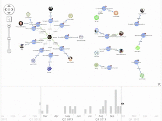
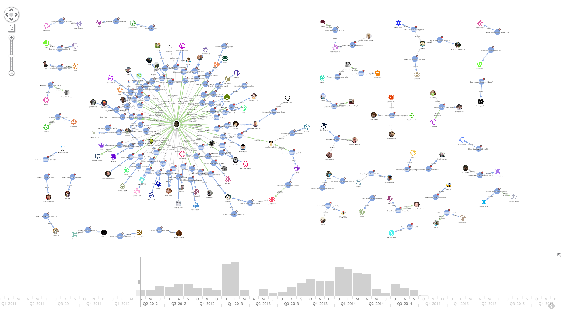
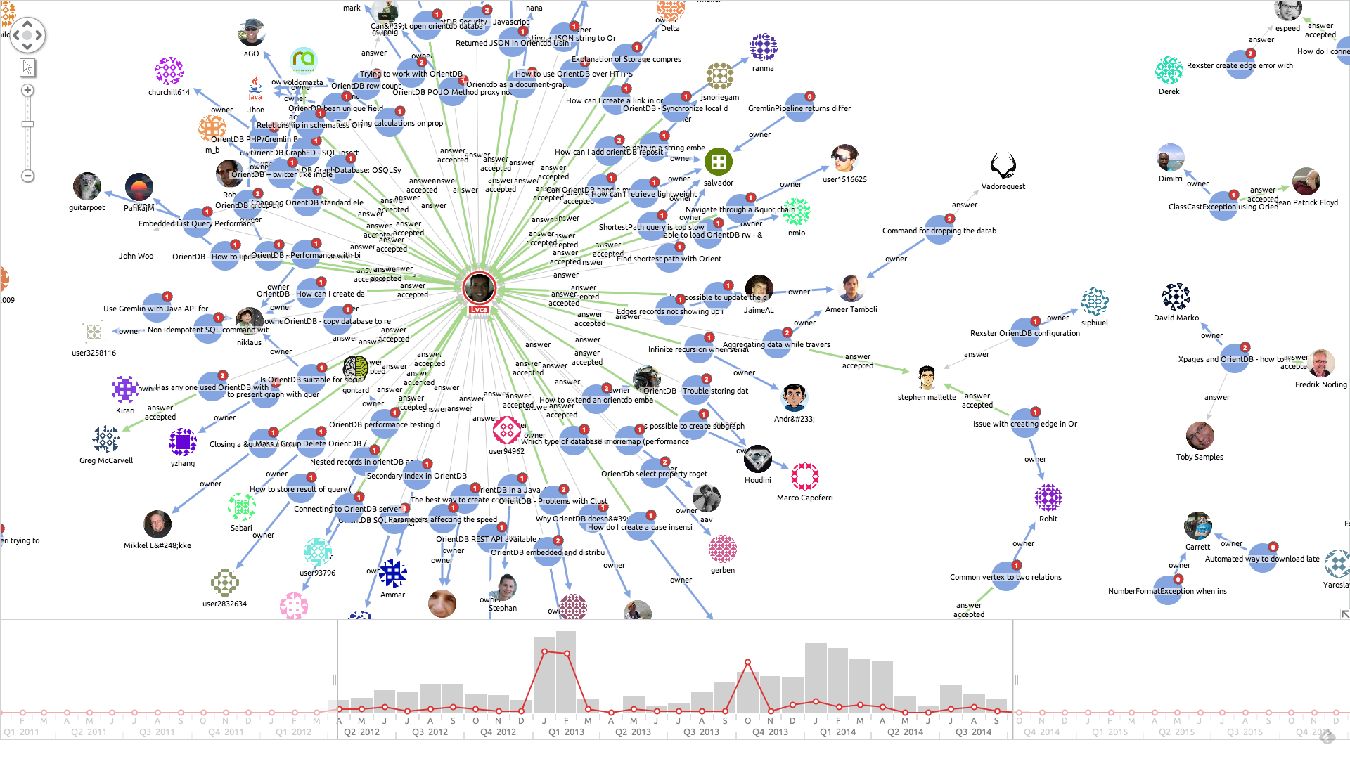
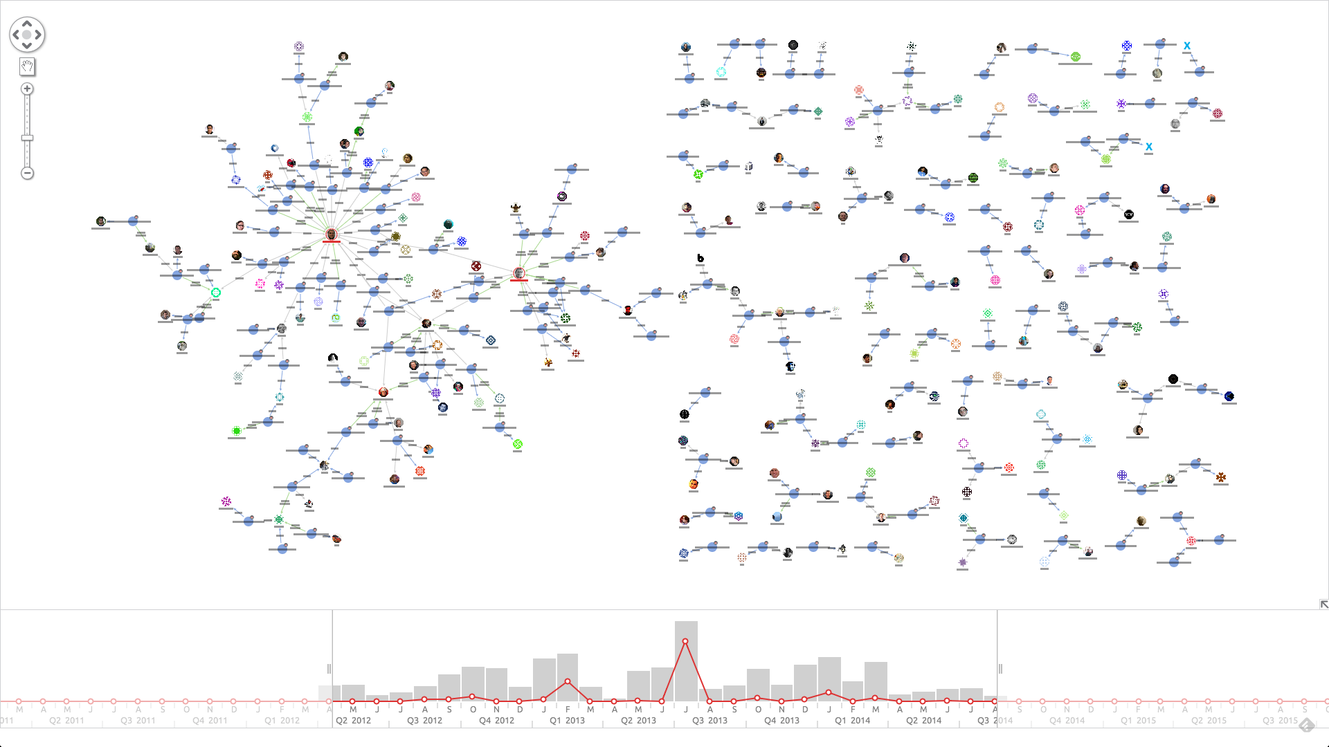
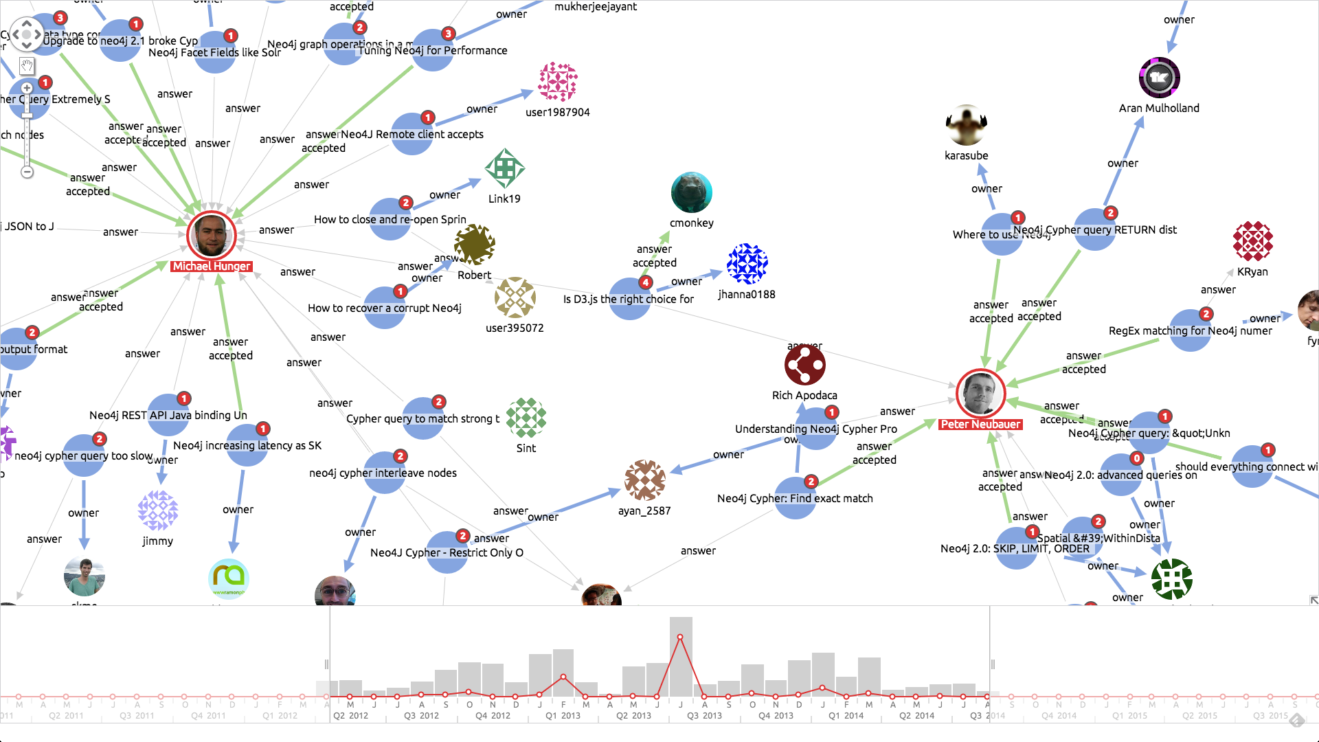
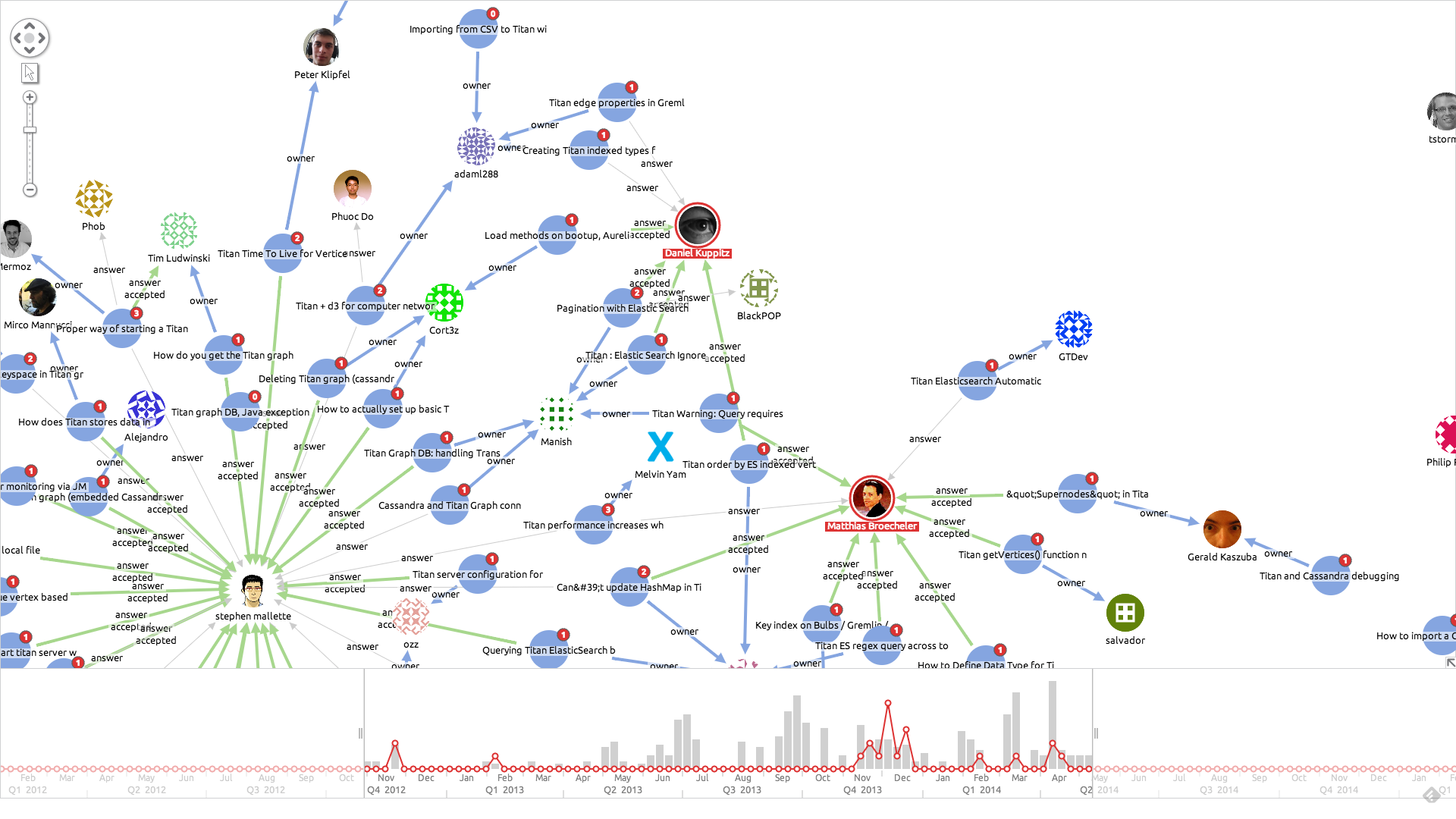
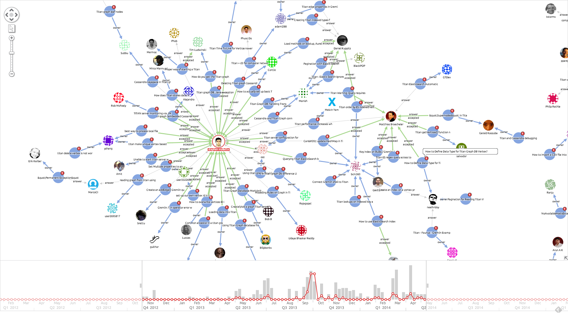
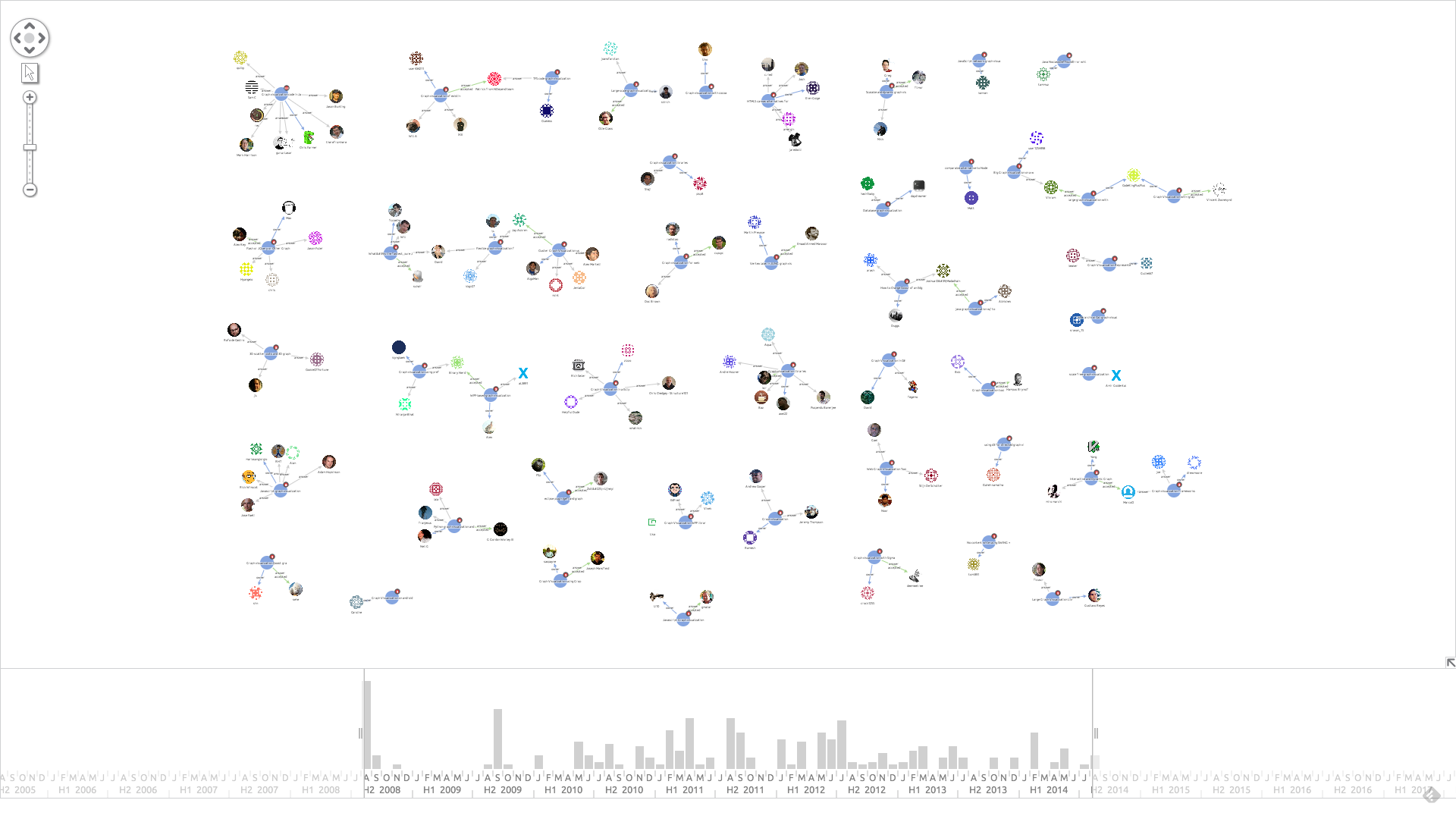
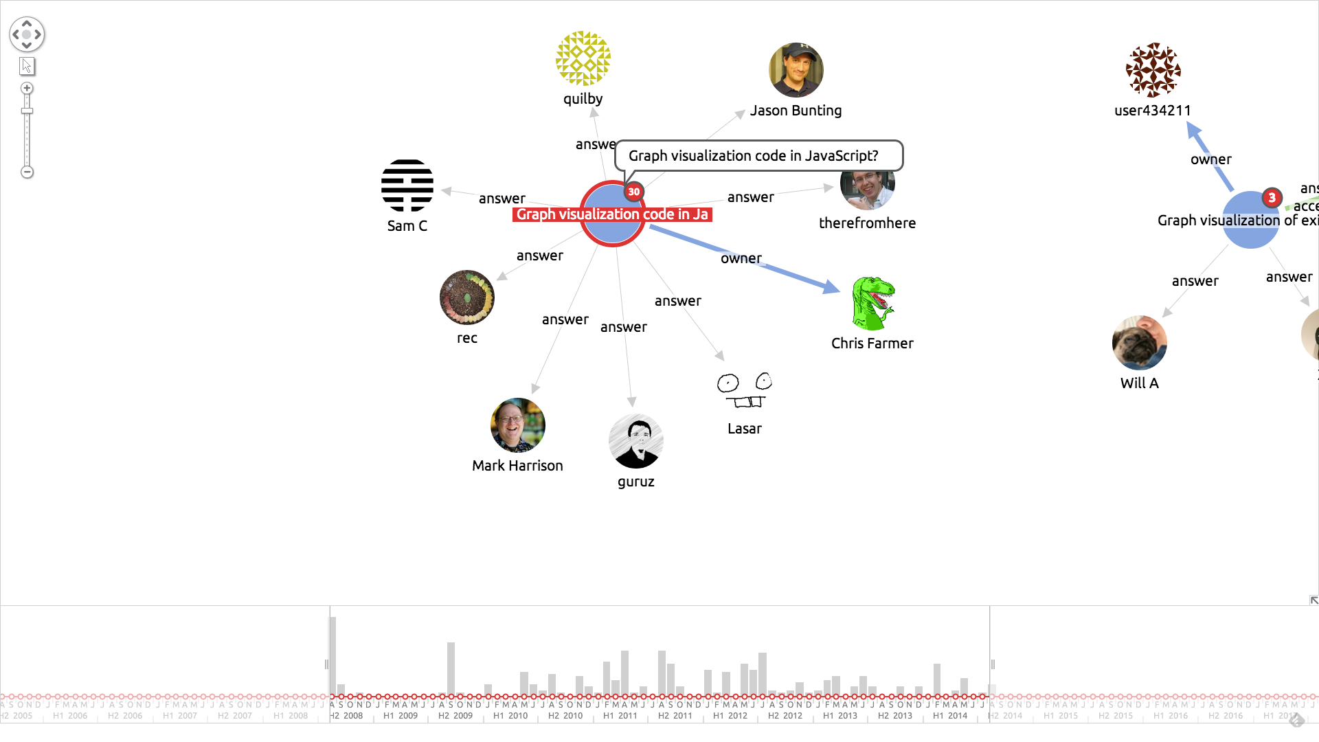
An interesting use for this kind of application is to find active contributors and experts on a given topic. We took a look at some Graph Databases that are active on Stack Overflow. Click any image to expand:
Try it yourself
If you’d like to try this for yourself, sign up for a free trial so you can access this demo on the KeyLines SDK site.


